In the beginning of the semester, we worked together as a team of Humanities 100 students and professors to transcribe Payne and Froehlich’s 1747 travel journal. Using the digital copy of the journal, various digital humanities tools, and help from our professors, my classmates and I were able to look at the journal from both very broad and very close perspectives. Every person was able to develop a different understanding of the journal, depending on the questions she asked throughout the process. Even though we each found our favorite medium of interpretation, every person’s contribution provided insight and allowed us to come to a greater understanding of the journal.
Realizing that our combining our efforts, talents, and interests would provide the most thorough analysis of Payne and Froehlich’s journey, we decided to do a collaborative final project. As a class, we created a website that contained our work from throughout the semester; every member of the class was responsible for contributing a different artifact for the site. Each digital humanities scholar chose her favorite digital humanities tool and we used Spiderscribe to divide the work and delegate tasks.
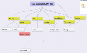
Fiona and I were both most interested in working with ArcGIS as our contribution to the website; after some discussion, we determined that our separate research questions provided diverse perspectives and having two ArcGIS maps would enhance our project.
The question that I aimed to answer was: How did location impact the perception of the Moravian travelers and why did they choose this route?
I combined the ArcGIS map that I created, which touched mainly on the perceptions are Moravians in different places, with Suné’s map, which provided a helpful overview of their journey.
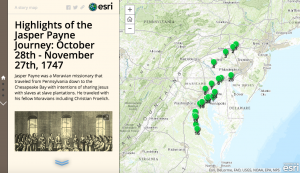
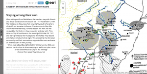
While I was extremely proud of my own ArcGIS map and the story it told, combining it with Suné’s only enriched the work that I had already done. Piecing the two maps together allowed me to obtain a more complete answer to my research question. Having done both distant and close readings of the journal, I had a few passages in mind to incorporate into the story map.
On the home slide of the compiled story map, I decided to put both the Waggon Map and the Mission Map layers, to provide an overview of their journey in the appropriate time period. On the next slide, I combined the information from Suné’s map about the beginning of their journey with my own. I was able to successfully insert a picture of the Pennsylvania countryside into the side panel. Though this was a fairly easy task on this slide, I ran into trouble inserting and formatting an image on the following slide titled “Stay in PA Overview.” I was unable to make the image fit the slide well so you can only see portions of it at a time and need to scroll to see the whole image.
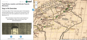
Though attempting to fix the image was time consuming and frustrating, it served as a valuable lesson; I learned about the glitches in and limits of the ArcGIS program. Also, I realize that this issue is a minor one that, in the grand scheme of the project, does not detract from the explanation of the travel journal.
In order to try to connect the digital artifact that I created with the original text, I sprinkled quotations from the journal throughout the story map. I was attempting to find an answer to the research question that I posed through the travelers’ own words. This allowed me to come to more accurate conclusions about the ways they were perceived in different locations and ultimately why they chose to travel along the route that they did.
Using Payne and Froehlich’s words and the layers provided by Professor Faull, my peers, and ArcGIS, I was able to uncover information about their journey that we had not discovered using any other medium. Though, the work I did on ArcGIS was made possible by the class working rigorously to transcribe and make sense of the original documents. By working so closely with one journal throughout the semester, I was able to become very familiar with the story. Originally I thought that I would come to conclusions and master the material, however as the semester went on I found myself asking more questions.
In my first blog post, On Material and Digital Archives: Old Info, New Medium, I wrote, “[a] major advantage to having information on a digital platform is that it can be analyzed in new ways.” When I wrote this post, this statement was more of a speculation that I was able to test as I learned to use different programs and tools. After working with TEI files in Oxygen, creating a timeline in Timemapper, exploring personal networks with Gephi, and documenting their journey on ArcGIS, I have proven my hypothesis and analyzed the same nineteen pages of text in many different and new ways.
In my first post, I also noted the possible dangers in digitizing the journal:
“One of which is the inevitable bias that comes with republishing work. By taking anything out of its original context alters the meaning of the work and skews how it is perceived by readers. Even just the way information is grouped, categorized, and framed impacts the way in which readers will come to understand it. Therefore archivists must be aware of the way they frame their work and display it to the world.”
In examining a document that is over 200 years old, it is important to keep the cultural context in mind. Regardless of how hard we try as scholars, it is impossible to eliminate our own biases and perspectives from the work we produce. Therefore it is important to regard the information as interpretations of the text rather than as whole truths. Not only are we framing the material differently, but we are also adding information that the travelers did not have. For example, on my story map, I show the slave population density and locations of plantations in the 1740s. I use these things as evidence, along with the text, to further demonstrate my point; in doing so, I am manipulating the material. The perspective of the scholar is essential to consider when reading a product from republished work.
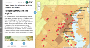
I have found that it is quite easy to be captivated by small details. This led me to become sidetracked and at times include unnecessary information that could muddle the actual material at hand. Keeping material focused and on point was a major challenge for me, especially with the abundance of accessible information on the Internet. For the final project I edited my work and eliminated superfluous information.
The resulting story map provided an answer to my research question: How did location impact the perception of the Moravian travelers and why did they choose this route? I found that the travelers were well received for the first ten days of their travel, as they were staying among fellow Moravians. But as they moved south, below what would soon be the Mason-Dixon line, they were met with skepticism. Their mission to share knowledge of Jesus with slaves made them tread into unfamiliar territory and interact with dubious slave owners. In addition, the pair had to travel through towns that had justices who could sign their passes. These were some of the factors that contributed to their travel decisions and the route that they took.
I am confident in the work that I produced and the conclusions I have come to, however I cannot say that my deductions are conclusive. The story map is a representation of my own truth, not necessarily Payne and Froehlich’s. The compilation of artifacts provided on our final project website, Payne-Froehlich Journal 1747: Moravian Itinerant Preachers Visit the Slave Plantations of the Chesapeake, are all interpretations of the text. However, making the information accessible and presenting it in one place allows researchers to explore the artifacts in a more complete way. The culminating final project not only allowed each member of the class to delve deeply into her chosen area of interest, but also allows us to add to the digital archive of historical information.
LINK TO STORY MAP: http://arcg.is/1D3OXWH
Bibliography
MacLure, Caroline. “On Material and Digital Archives: Old Info, New Medium.” Web blog post. The Humanities Now! Bucknell, 25 Jan. 2015. Web. <https://thehumanitiesnow2015.blogs.bucknell.edu/2015/01/25/on-material-and-digital-archives-old-info-new-medium/>.
Swart, Suné. “Highlights of the Jasper Payne Journey: October 28th – November 27th, 1747.” ArcGIS. Bucknell, n.d. Web. 05 May 2015. <http://bucknell.maps.arcgis.com/apps/MapJournal/index.html?appid=546bf0af1ad740dea6aa4149d3d8ea86>.
MacLure, Caroline. “Travel Route, Location, and Attitude Towards Moravians.” ArcGIS. Bucknell, n.d. Web. 05 May 2015. <http://bucknell.maps.arcgis.com/apps/MapJournal/index.html?appid=64e5bb56e60f48c48440a3ab806b2c8f&edit>.
Course website: https://thehumanitiesnow2015.blogs.bucknell.edu/
Final project website: https://paynefroehlich.blogs.bucknell.edu/
Leave a Reply